Year: 2017–2021
Type: personal
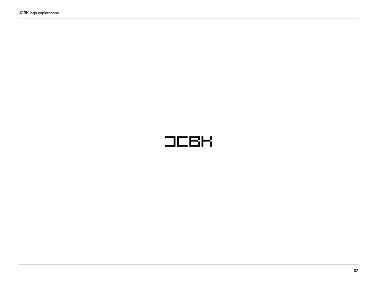
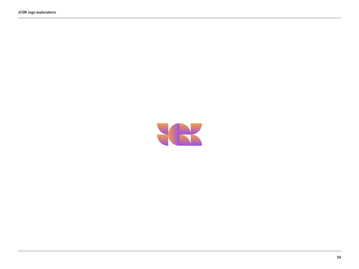
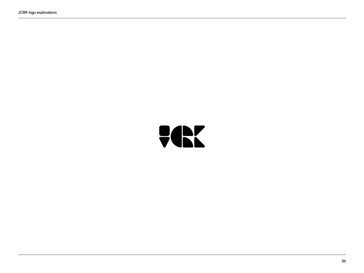
Designing the JCBK logo was an arduous process. Spanning a few years, I’ve explored different directions and styles, some promising, most not. I didn’t have any specific direction in mind but I wanted the logo to be simple, symmetrical, based on geometric shapes and to contain the letters JCBK (though I did allow myself to go fully abstract as well).
Below you’ll also find a selection of the ideas I’ve tried.


